Blog

Posted in Projects

App Icons

regalado-appicontemplate
Amusement Park search App Icon

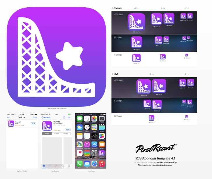
I really enjoyed the video done by Michael Flarup, and I have to agree with a lot of points he made, especially when it comes to simplicity and memorability. I’ve done icon work before, and one of my basic rules is that color and shape share an inverse relationship in order to maintain some semblance of simplicity – the more complex the shape, the less variety of colors there are, and vice versa.

I hope that it’s obvious what the larger shape on the left is, but just in case it isn’t, it’s supposed to be a roller coaster section. The star is just a whimsical shape to fill up the white space (or purple). I chose the color gradient because I thought that it was the best contrast to the white shapes while still being lighthearted enough.

Posted in Projects

Animated eCard

regalado-ecard
eCard for the bored worker

After a long week of work, people are often plagued with ennui (at least, I know I am), so I wanted to create an e-card for co-workers looking to cut loose. The GIF is a generic party invitation with the obvious phrase, but the contrast between the smiley’s initial appearance and subsequent excited face is supposed to represent a transition from slightly bored to pretty stoked. The transition from day to night translates to an end-of-day, “it’s Friday” mood. While shifting the backgrounds was a new experience for me, animating the smiley with individual frames was the most fun – I wanted the facial expression change to seem natural, after all.

Posted in Exercises

Layer Comps

regalado-layercomp3regalado-layercomp2regalado-layercomp1

tumblr_o6l3ydhfs81rxhhcro1_400
1. Elyse Willems
ksx7xs4k
2. James Willems
tumblr_inline_ne4e5tszi11r1ungh
3. Adam Kovic
maxresdefault
4. Spoole
concrete-wall
5. Concrete Wall
4-520brnfinal_small
6. Longhorn Horns
bf4926e9692642e711dc584334b6a7c7
7. Viking Beard

The purpose of the e-card is to congratulate girl gamers – depicting Elyse as the badass was a real joy, as she’s often treated as the resident fool among her game-savvy male coworkers. The horns, beard and blood spatter are meant to symbolize action, domination, and conquest – despite their masculine nature, having Elyse in the foreground turns it into female empowerment, hopefully.

Posted in Projects

Masking & Warped Text

regalado-hulaaloha
Hula Girl says Aloha!
regalado-bulldogspike
Spike the Bulldog
regalado-artistschoice
(Artist’s Choice) Mini Guinea Pig

I really enjoyed this exercise. For me, the biggest challenge and most frustrating part of the project was refining a hair mask; I could never quite get the strands to remain whole, as adjusting the smart radius would cut them in the middle. I had better luck and success with warping the the texts.

Posted in Projects

Web Background

Offset Tile

For the background, I used a repeating tile with a simple shape. I highly value minimalism in conjunction with functionality, so I didn’t want to have a complicated shape plastered all across the back of the page. I purposely used a bland hexadecimal color (#635d5a) that wouldn’t sharply contrast with the background color; no one likes eye strain, but I’m especially bent on making color schemes easy on the eyes rather than eye-catching.

Posted in Projects

Creature Composite


Final Composite Image

Composite Creature
don’t make him angry

Seems like I’ve created a cute monstrosity.

  1. I used Quick Selection to cut the pieces from their respective images, then refined their edges with an emphasis on smoothing and edge shifting. I scaled the different parts down to match the size of the main body. In my opinion, my biggest success was rotating the parts to look like they grew naturally.
  2. I used Image Adjustments to de-saturate the original colors, darken each piece, and to blend all of their hues into a dark blue. I also used Quick Selection once again to highlight some spots and increase their brightness. Blending the images together to appear believably connected was my biggest challenge, as they were all different colors and some had a sunlight sheen.
  3. Not wanting body parts to appear out of place despite my blending, I rearranged the layers so that the ears were separated (one would be placed behind the head) and the tail looked like it came out of the rump rather than the beast’s side.
  4. For the background, I decreased the brightness and saturation. I used Quick Selection for the area below the beast and darkened it to mimic a shadow.

Sources Images (w/ hyperlinks in captions)

Source 2: Tufted Deer
Source 3: Bunny Ears
Source 1: Baby Musk Ox
Source 4: Cat Tail
Source 5: Cat’s Glowing Eye
Source 6: Shady Grass 


Posted in Projects

Dream Event Flyer & Web Banner

regalado-dreamflyerFor this flyer, I aimed to appeal to the wannabe hackers and gamers who strive really hard to look badass by making my photo ominously dark. The event itself, a twist on “Greek Life,” is basically a live podcast where I would rant about various aspects of nerd culture and talk about trending news in the geek world.

While I did have a hard time adjusting the colors, my biggest challenge and my best success was finding the right filter that darkened the layer enough without blotting out some parts of the background in the photo.

regalado-dreambanner
Dream Event Banner

Geek Strife has another upcoming live event during the opening week of the Khan Theater! The flyer didn’t feel iconic enough, so this time around I used what I consider better photo to be the central focus. I cut out a portion, smoothed the edges, and then put it through several filters, most notably Posterize. I also included the same font and color scheme from the flyer. This time around, the biggest challenge and my best success (I think) was being able to modify the font sizes and alignment to fit into their spaces while still getting ample attention.

Posted in Projects

Photo Restoration

For this assignment, I processed two different but similar photos. The first, featuring who I assume to be the Sherrills couple, was faded, full of spots, and had an inexplicable white bar across the top. I manually adjusted the levels, used content-aware fill, and did quite a bit of spot-healing brushing. As for the Star Trek picture, I created new layers for each colorization; Kirk’s uniform, Spock’s skin, everyone’s hair, etc. For you Trekkies, I’m well aware of the inaccuracy of the uniform colors, but I was just feeling whimsical.

Posted in Projects

Black Cats

regalado-blackcats
Black Cats – photo edit done by yours truly

An exercise in basic editing in Photoshop; flipping, cropping, and converting the image to black-and-white are a few actions I practiced.

Posted in Unsorted

Hi. This be me first post, yarrrgh.

I’m Samuel Regalado, but I usually go by Sam – I’m only “Samuel” when I’m in trouble.

I am proud to admit that I’m a huge geek, fawning over whatever collectibles I can get whenever I can afford it and catching up on the critically acclaimed and panned whether or not I have the time to spare. I hail from the great city of Boston, but I call Raleigh my home.